Nonli graphs show how a selection of data changes over time. Choose the accounts and period, add the metrics you need, then use Group by to switch from an overview to an account comparison. The leaderboard complements the charts with a ranking.
The screenshots below use the English interface. They were taken at different times, so their figures should not be used to reconcile totals across screenshots.
1. Open graphs and select metrics#
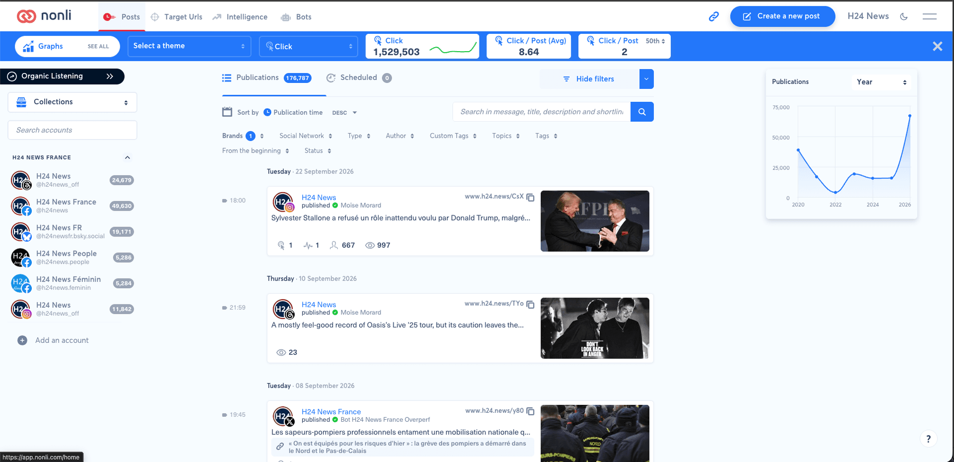
In Posts, click SEE ALL next to Graphs in the blue bar. Once graphs are open, the Posts button takes you back to publications.
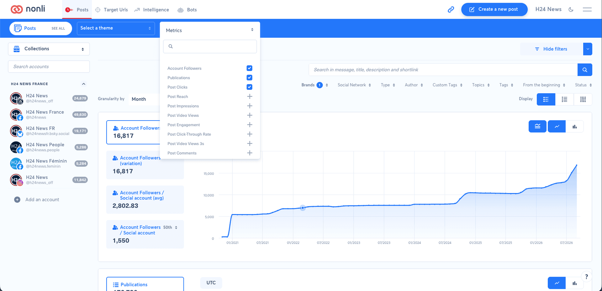
Click Add metric to open the Metrics menu. For example, select Account Followers, Publications and Post Clicks. Checkmarks identify selected metrics; + signs let you add others. Use the search field to find a metric.
Each added metric has its own chart. Publications tracks publication volume, Post Clicks tracks clicks and Account Followers tracks account followers. Followers are account-level data: filtering publication text or type does not measure followers acquired through those publications.
2. Define the comparison scope#
Select accounts in the left column and check the filters above the graphs. Use Brands, Social Network, Type, tags or search as needed. These filters help narrow down the publications being analysed. Any selected theme should also match the scope you want to examine.
Choose the period using the filter shown here as From the beginning. If filters are hidden, reveal them before looking for this selector. See how to filter publications for help combining criteria.
Three controls answer different questions:
| Control | What it determines | Example |
|---|---|---|
| Period | The date range being viewed | The range selected in the date filter |
| Granularity by | The chart’s time intervals | Month displays monthly intervals |
| Group by | How series are split | None for an overview, Social account to distinguish accounts |
Changing Granularity by does not replace choosing a date range. Keep the same period, granularity and filters when comparing accounts.
3. Group by: None for an overview#
With Group by → None, each chart presents its metric across the selection without splitting it by account. Use this view to answer questions such as: “How does publication volume across my selection change month by month?”
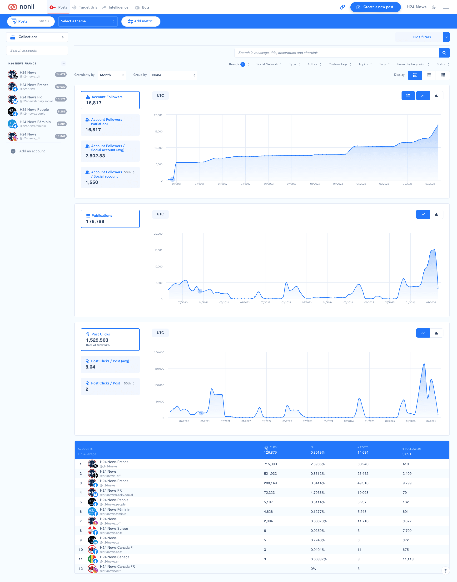
The cards on the left offer different readings depending on the metric: overall value, variation, average (avg) or 50th percentile. The 50th percentile is the median, not the average. Also check the denominator: Post Clicks / Post (avg) is an average per publication, while Account Followers / Social account (avg) is an average per social account.
4. Group by: Social account to compare accounts#
Choose Group by → Social account to split a metric between accounts in the selection. Each card shows the account name and network icon; its colour identifies the corresponding chart series.
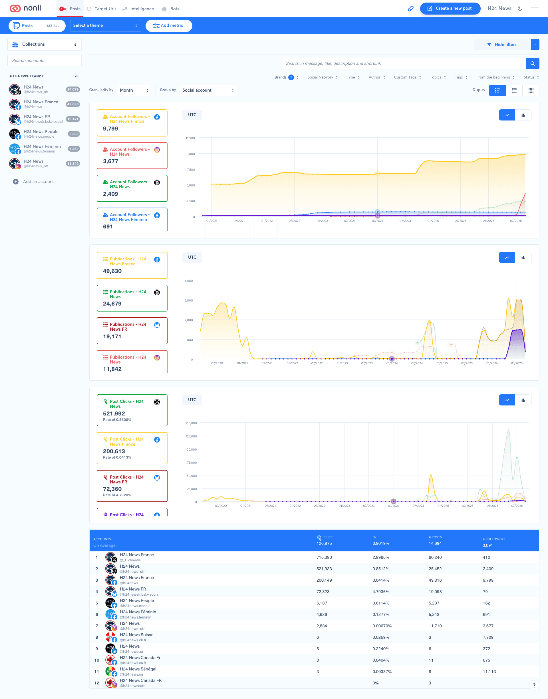
In this example, the H24 News accounts on Facebook, Instagram and Threads appear separately. Multiple Facebook pages also remain separate accounts: this setting does not combine them into a single Facebook series.
Choose the setting according to your selection:
| Selection | Useful setting | Expected reading |
|---|---|---|
| Multiple accounts across networks | None | Follow the whole selection |
| Multiple accounts across networks | Social account | Compare individual accounts, using the icon to identify their network |
| Multiple accounts on one network | Filter Social Network, then use Social account | Compare pages or profiles on that network |
| One account | None | Study that account; grouping does not add other accounts to the comparison |
| Publications of a given type or tag | Apply the filter, then use Social account | Compare metrics for the matching publications per account |
For example, to compare Facebook page clicks over the same period, select the relevant pages, filter Social Network to Facebook, add Post Clicks, then choose Social account. Add Publications to put clicks in the context of posting volume. An account that publishes more may receive more total clicks without receiving more clicks per publication.
Switch back to None, keeping the other settings, to view the overall trend. Grouping changes how series are displayed; it does not replace filters.
4.1. Which options appear for your selection?#
The Group by menu adapts to the values selected in the filters:
| Option | Availability and purpose |
|---|---|
| None | No grouping; required for comparing two periods |
| Type | Available even without selecting types; splits publications by type |
| Social Network | Available even without selecting networks; groups results by network instead of separating each account |
| Social account | Offered when multiple accounts are selected. With no explicit account selection, availability depends on the number of accounts in scope. With exactly one explicitly selected account, use None |
| Brands, Author, Tags, Topics, Custom Tags | Each corresponding grouping appears when you select multiple values in that filter |
For example, select two brands in Brands, then choose Brands in Group by to compare them. To compare networks instead of accounts, choose Social Network. If Brands is missing while only one brand is selected, select multiple brands in the filter first.
4.2. Example: compare selected topics#
To see which subjects generate the most clicks within your selection:
- Open the Topics filter and select multiple subjects to compare. The screenshot has seven selected topics, including faits divers, politique, societe and justice.
- Add Post Clicks using Add metric.
- Choose Topics in Group by. This option appears after you select multiple topics.
- Set the period and Granularity by, here Day, to read daily changes.
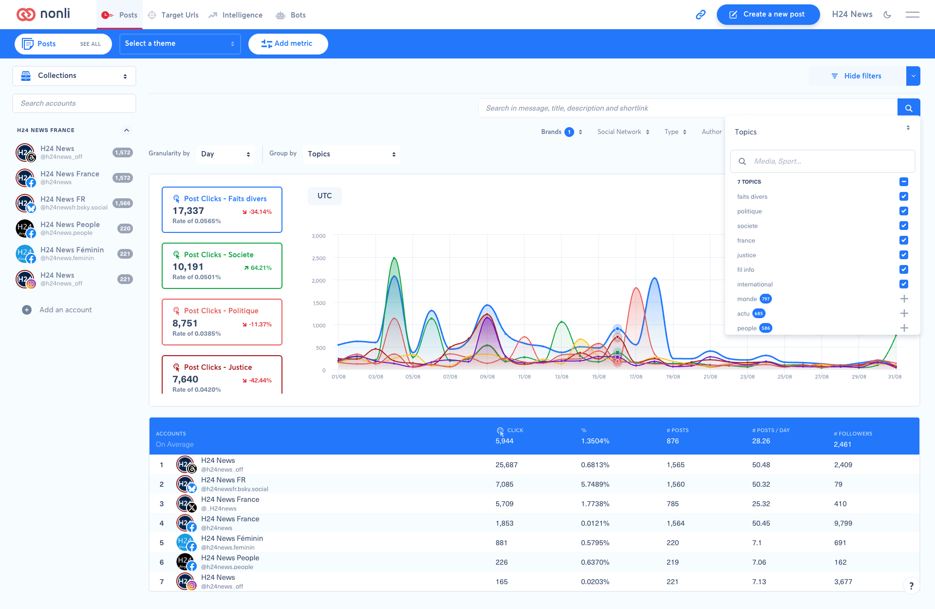
Each card and its curve represent a selected topic. The subjects monde, actu and people, shown with a + in this screenshot, are not selected: they are not automatically added to the comparison. Change the checked subjects to change the comparison scope.
To rank topics, click the value on a card: 17,337 on the “Post Clicks - Faits divers” card ranks them by click volume, while Rate of 0.0565% ranks them by rate. The topic leading by volume may not lead by rate. These clicks rank the topics; they do not turn the ACCOUNTS table below into a topic leaderboard.
Use this view to identify subjects that generate click spikes, then add Publications to put them in the context of posting volume. The Topics filter and grouping are separate from the Select a theme selector in the blue bar.
The table below is still labelled ACCOUNTS: it ranks accounts, not topics. To compare two periods with Compare afterwards, set Group by back to None.
5. Compare two periods: Group by must stay on None#
Time comparison requires no grouping. Set Group by → None before using Compare. If you were using Social account, switch back to None: comparing accounts and comparing periods are separate views.
- Choose the reporting period in the filters. The screenshot uses Last month.
- Choose the time interval in Granularity by, here Day for a daily view.
- Check that Group by is set to None.
- In Compare, choose Last period to compare with the preceding period.
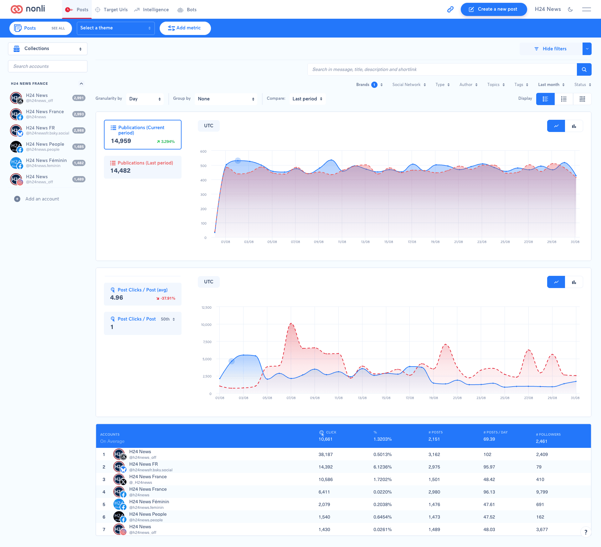
Current period means the period selected in the filters, even when you selected last month. Last period means the preceding reference period. Do not confuse the Last month reporting filter with the Last period comparison option.
In the screenshot, the blue curve represents Current period and the dashed red curve represents Last period. They are overlaid to compare their relative evolution over time. The Publications cards show 14,959 versus 14,482, an increase of approximately 3.294%. This percentage expresses the change relative to the reference period, not a share of publications.
Keep the same accounts, filters and metrics when reading this comparison. If Compare is unavailable while grouping is active, start by setting Group by back to None. The reporting period must also support comparison: if the selector is still missing, choose a period such as Last month rather than the current day.
6. Enable the leaderboard#
- Click Add metric and add the metric you want to rank if it is not already selected.
- Click the metric for which you want to display the leaderboard.
- Enable Leaderboard.
The table below the graphs complements the time series with a ranking. In these screenshots, it includes accounts, clicks, post counts and followers. Group by distinguishes chart series; the leaderboard displays a ranking. Do not assume that changing the grouping also changes the ranking metric.
7. Check a comparison#
Before interpreting a difference, check the company, accounts, theme and filters, then the period and displayed timezone (UTC in these screenshots). Compare the same metric and reading: total, average or percentile.
A missing value does not necessarily mean zero: available data may differ by network or arrive with a delay. If in doubt, start again with a known account and fewer filters. To examine a specific publication, see its performance statistics. To analyse data outside Nonli, see exporting post statistics to CSV.